

How to Build a Website with Tailordom.
Introduction
The advancement of technology over the years has moved the creation of websites from just the traditional way of building scalable, secure and optimized websites by writing lines and lines of code to pure creativity - bringing ideas to life with the ease of dragging and dropping. This is the reality of the no-code technology and at the forefront of this revolution is Tailordom, a no-code website builder that makes design and deployment of bespoke websites effortless and possible.
Tailordom is a tool that empowers her users to create a bespoke digital presence without writing a single line of code. Whether you are building a personal page, an online store, a corporate site, an educative platform or even a management system, Tailordom has you covered as it provides you with an opportunity to build a website which is enhanced, scalable, optimized, accessible, cost effective, accepted on multiple devices, responsive, innovative and meets standards.
Prerequisites
To effectively build a website using Tailordom, you will need the following
Getting Started
This is a step by step procedure to build a website using Tailordom. Let’s get started.
Step 1
Go to Tailordom.com and create an account. The Navigation bar contains details like the Login and a Create a site button. To signup on Tailordom, click on the Get started button and fill in the details required, verify your email with the verification link sent to your email and then proceed to login.

Step 2
Once logged in, your dashboard opens up and shows the already existing websites you are working on. If there is none, select a choice from the provided templates that suits what you intend to build or you can start afresh by clicking the blank template. Each choice opens up the editor and you can begin the editing process.
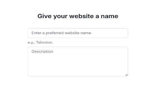
Step 3
When you select a template—either a blank template or an existing one—to design your website, you will be prompted to provide a website name, a detailed description of the website, and then specify a font style, color, and upload your logo.
Step 4
The name of the input helps with autofill if enabled. We can edit placeholder text, decide if a field is required, and add other properties using the plus button. For example, we’ll add another text input for the message body, change the text box to say message, set the input type to text area, and update the name and placeholder text accordingly.
Inside the Editor
Once you select a template, the styling options for the chosen component can be found in the right sidebar of the editor. At the right sidebar of the editor, you will find a Layer and below it lies a list of components such as size, layout, positioning, spacing, typography, background and effects Size has a dropdown that shows the Width, Height, Min W (minimum Width), Max W (maximum Width), Min H (minimum Height), max H (maximum Height).
When min W is set to auto, and max W set to none, the Width can be any pixel of choice to allow flexibility on the number of pixels you want the width to be. If min W has a value, say 200, and max W a value of 900, the width cannot be lower than 200 or higher than 900. It must take a value between 200 and 900.Layout has a dropdown that shows the Display, Direction, Align, Justify and Gap. For any component selected, a display must be set first otherwise the other components in layout would not be affected. Choose a display that best suits your goal – block, flex, grid, inline. Direction displays the content in the container in rows and columns. The first button displays the content in rows and the arrow key beside it is used to reverse the row. The next button is used to display the content in columns and the arrow key beside it is used to reverse the column. Align is used to display (align) the items in a component vertically. Each item has its individual function.
Stretch is used to stretch the width of the individual components of the container. Flex start moves the content to the left. Flex end moves the content to the right. Baseline moves the content to the left. Center moves the content to the middle. Justify is used to justify the contents horizontally. The buttons are used to push the content to the left, right, center, add spaces between components. Gap is used to add gaps to the contents in a container.Positioning contains 3 important functions – Position, Top, Bottom. The first step is to select a position from the options available whether static, relative, absolute, fixed or sticky. Each position has its own use as every function aims to place the container at the top or bottom of the screen. Spacing deals with the margin and padding of a container. The outer box is the margin while the inner box takes the padding and each has the responsibility of adding spaces to the component of a container. Each box has four sides – top, left, bottom, right. Typography contains the font, weight, size, align, style, height, color, decoration, letter spacing, text indent (paragraph), column and case (uppercase or lowercase). This helps in selecting a font needed for the container, the weight, size, style and other items that suit your preference. Background just chooses a background color for that component. Effects contain blending, opacity and cursor action.
Step 5: Preview and Publish
Once you’ve completed your design:
1. Click Preview to see how your website will look on various devices. 2. If everything looks good, click Publish. 3. A modal will confirm that the website is published successfully. 4. You will receive an email with a link to your newly launched website.
Congratulations, your website is now live!
Need help to get started?
For any further questions, our 24/7 expert support team is available to assist you. You can also seek help in our Community Space here.

